Homework activities will be posted throughout the week. I expect to assign a total of at least 60 points worth of activities over the entire six weeks. These will be graded Complete/Incomplete. A Complete attempt earns you the full points assigned, an Incomplete earns you zero points. You may do as many as you want, although a maximum of 50 points will contribute to your final grade. You may also submit them whenever you want, although you will benefit most from them if you complete them as they are posted.
For credit, submit through Blackboard unless otherwise specified.
I encourage you to also submit your work to the forum, so other people can see your work and comment on it.
5 points - Find a bad plot Find a bad plot in the media (newspaper, magazine, advertisement,…). Answer the same questions we asked in lecture (Jun 25). Include the graph, a citation or link to the source, and your commentary.
5 points - Fix a bad plot Take one of the “bad” plots we saw in lecture and create a better version. To get the data, you’ll probably have to do your best to read it off the bad plot. Include the data you used, your plot and a brief description of what you did differently and why. (You can do this now in any graphing program you choose, or wait until we have learnt some ggplot2 and use it to create the graph).
3 points - Calculate the lie factor Find a misleading graphic and calculate it’s lie factor. Include the graphic and explain your calculations.
3 points - Describe a graphic Find a plot in the media (newspaper, magazine, advertisement,…) and describe it. What are the data? What are the basic geometric objects? How are the visual properties of the geometric object mapped to the variables? Are there any graphic or non-graphic annotations? Include a copy of the plot and your description.
3 points - A new geom Explore a geom we haven’t talked about, provide an example that you created (you can use any data, (e.g. diamonds, movies,…) but it should not be an example someone could find in the help page for the geom.) Submit a .pdf or .html file with your example.
5 points - Overplotting Read the help on ?geom_point. What are some of the suggestions for dealing with overplotting? Try some with one of the scatterplots of the diamonds data and comment on how effective they are. Submit a .pdf or .html file with your experiments and comments.
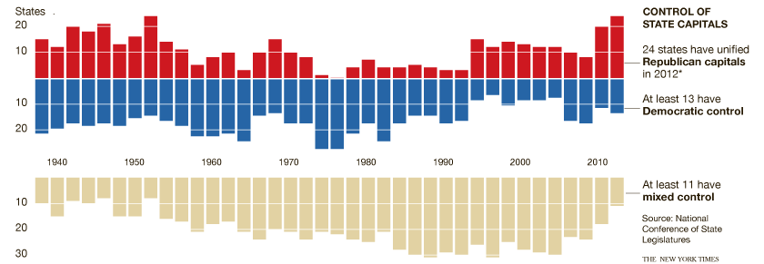
4 points - Divided State Legislature We looked at this plot when we were describing graphics. Use the data at http://vis.cwick.co.nz/data/divided.csv to recreate OR provide an alternative view of the data using ggplot2.
2 points - Themes Install the ggthemes package and apply one of the provided themes to a ggplot2 plot you have made. Make at least three other changes to the appearance of the plot using the theme function. Submit your R script as .pdf or html.
4 points - Dotplots In the reading for this week, Cleveland & McGill (1984), Cleveland states he prefers dotcharts to barplots and refers to another paper. Find the paper and read it. Summarise why he prefers dotplots.
4 points - Pie charts Pie charts have a bad reputation. Is it deserved? Read No Humble Pie: The Origins and Usage of a Statistical Chart and summarise the good and bad aspects of pie charts.
3 points - Perceptual tasks Return to a plot you found earlier (1.1 or 1.4) or find a plot in the media and discuss the important comparisons in the plot and the perceptual tasks required to make them. Could it be improved by using tasks that are easier?
4 points - Fifa leagues I posted a link to the data and code I used to recreate the NYT plot of the most represented soccer leagues in the 2014 Fifa World Cup under Friday’s lecture. One of our big criticism’s was that the England, Germany and Italy didn’t really stand out, despite that being the headline. Make an improved version of the plot that remedies that, and remedies any other criticisms you have. Submit your R code, plot and commentary.
3 points - Preattentive processing Watch this video. Write a short description of the principle the video illustrates and how the principle is relevant to producers of statistical graphics. (This description should be aimed at someone who has not taken the class to read after viewing the video).
4 points - HCL Read HCL-Based Color Palettes in R and generate your own sequential, diverging and quantitative palettes (different from those generated in the vignette). Apply them to any ggplot2 plot of your choice with scale_xxx_gradientn and scale_xxx_manual. Submit your R code and plots as a .pdf.
4 points - Colour-blindness Find a scientific article in your field has a few graphics that use colour. Using the color oracle tool view the graphics as though you were colour blind. Do the colours they use still convey the same information to someone who is colourblind? If they don’t, can you suggest a better colour palette? Write up your experience, including screen shots of the original and colourblind versions of the figures. (If you are colourblind, you might want to try one of the full colour simulators, like http://daltonize.appspot.com/).
2 points - Math labels Find out how to include mathematical symbols in the title or axis label of a ggplot2 plot. Produce a plot with the x-axis labelled \(x_i\), the y axis labelled \(\text{Fitted values, } \hat{\mu}(x_i)\).
5 points - Variation in delays Create another visualization of the delays at IAH (or HOU, or both) that includes some indication of the variability in delay times. Submit your plot and code.
5 points - ggvis basics Read http://ggvis.rstudio.com/ggvis-basics.html and then recreate a scatterplot you have made in a previous homework/assignment/or one from class using ggvis instead of ggplot. What are the big differences in syntax? Submit your code, and commentary.
5 points - Mulitdimensional techniques Use one of the datasets mentioned in the code from Wednesday Jul 30th (randu or flea) and experiment with the techniques presented in class. What do you learn about the data? Submit your code, and one or two of the more interesting plots.
5 points - Seriation Read Section 5 of the seriation vignette http://cran.r-project.org/web/packages/seriation/vignettes/seriation.pdf. Summarise one example/method you found interesting and try it out on another data set.